We were doing bounce rate analysis on Ties.com since bounce rates are closely associated with visit quality and relevancy of your landing pages. We started by looking at pages that had high volumes of traffic but were the worst offenders in terms of bounce rates. If you need help generating this report for your site, ping me. This is the tale of how we decreased bounce rates by 16%.
We consider our sites dynamic. In other words, we are not afraid of a/b testing and making changes to improve end-user experience.
That said we wanted to look at our homepage and find out why it had a bounce rate. Certainly there were pages that needed more attention but we wanted to deploy strategies on pages that required little help from the Development. We were also considering low-hanging pages marketing could tackle. The Ties.com homepage was were the “x” met.
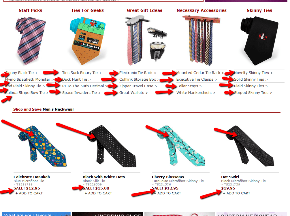
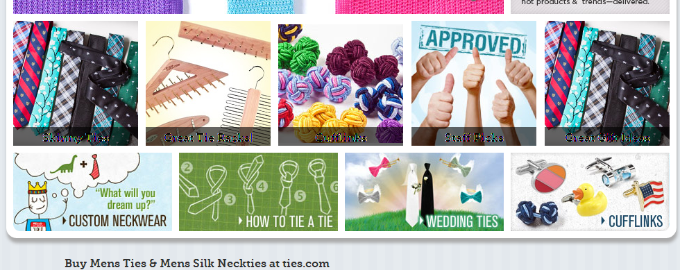
We reduced clutter. At the end of the day, would we, as shoppers come to our site and shop as it was. The resounding consensus was to remove links, images – anything that was fighting for attention. Here is a before and after image the middle of our homepage. Can you see the difference?
The Clutter: About 18 months ago, we placed five merchandising blocks on our homepage and saw an immediate boost in conversions. Our in-page analytics revealed enough customer engagement for us to make the merch blocks a standard feature of the site. But as always you have to continue analyzing our data. We later discovered that users were becoming less interested in the links we were providing below the merch blocks. To add, all the products on the “Shop and Save” section combined were getting a meager 1.3% of total clicks from the homepage. Also when you consider links-to-page ratio, these two features (merch blocks and “Shop and Save”) were hogging lots of juice. All of these images/links/products looked both messy and more importantly took away customer attention. While the original idea of these two sections was to increase engagement which it accomplished, later our data revealed that they also confused people with too many choices. There were too many choices. Too much call for attention.

Removing the Attention Mongers: Because the images on the merch blocks were engaging, we decided to eliminate everything around it – the title was moved inside the merch block to be less invasive, the links were removed, and the “Shop and Save” section were removed. Below is the new version we tested with all of our West Coast sessions and noticed a reduction in bounce rates for those users. This conclusively gave us the ammo to change the homepage permanently to track bounce rates.
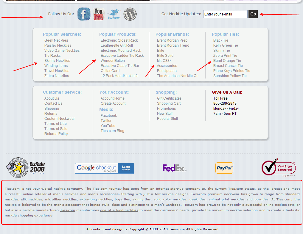
Footer Issues: And since reduction was the motto, we tackled the footer next. Again, remember we were looking to reduce bounce rates and our hypothesis was that there were too many calls to action AND our data proved there wasn’t enough customer engagement for every feature. Our old footer had tons of links to pages we wanted to drive traffic to. We also moved our social media buttons and email submission above the page fold.
Footer After: As you can see, our new footer is simplified. The footer now has a more clean look and has logos of partners/vendors we work with to add credibility to our site. Leveraging awards and the notoriety of partners like Amazon.
Results:
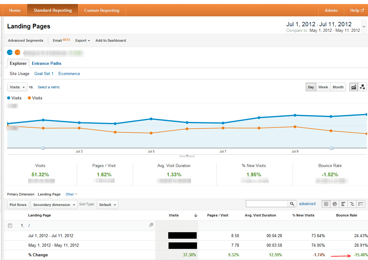
We removed all the clutter to visually simplify the site. What does this mean? Here is a snap shot of our analytics showing the decrease in bounce rate over the course of two weeks.

I hope you find this helpful. We’d love to hear what you have done to decrease your bounce rates.


